Book Design
From ideation to printed and digital collateral implementations
STONES AND FLAGS
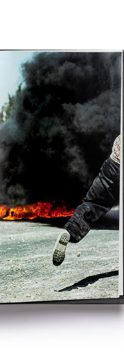
The Stones and Flags project poses a storytelling challenge. Illustrating conflict and making it accessible - on the one hand designing a practical and useful book and on the other hand the essence and consequences of the action brought to the reader in this book. The need to bring the viewer to a consciousness of discomfort arising from a violent scene but devoid of antagonism on his part.
Ziv Koren's photographs are the basis, the trigger for this series of Uri Lifschitz paintings and the entire book - doing exactly that. Many of the photographs have an iconic presence, a peak moment that mediates to the viewer a sequence of points in time that join together to form a defining and historical event.
I perceived the design of the book as a continuation of the conversation with the two artists, Lifschitz and Koren - and the understanding that the value of the book is measured from the first impression, being an object that affects the readers when holding the book, in the feeling, the experience and burning it in the readers' memory.
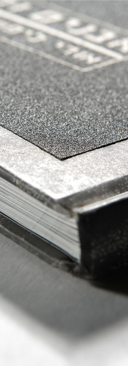
For this purpose I have designed this limited edition book, wrapped in rough black sand paper, the title is silkscreen printed in white. Thus, the immediate reaction of those holding the tactile book cover is one of discomfort on the one hand and on the other hand an invitation to feel. as if their fingertips had touched an open wound.
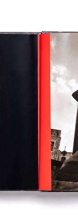
As a result of a fruitful dialogue with the book publishing team of Yediot Ahronoth, editor Ruth Ben Ari, and CEO Dov Eichenwald, who gave me the freedom to create, I based the layout of the book's pages on a balance between the paintings, photographs and texts in black and red typography, which together create a structure that maintains a lot of tension and energy, one that does not let the readers down, does not give respite - conveys the horrors of violent conflict, war and sorrow in all their might.
THE MORGUE
TEL AVIV MUSEUM OF ART
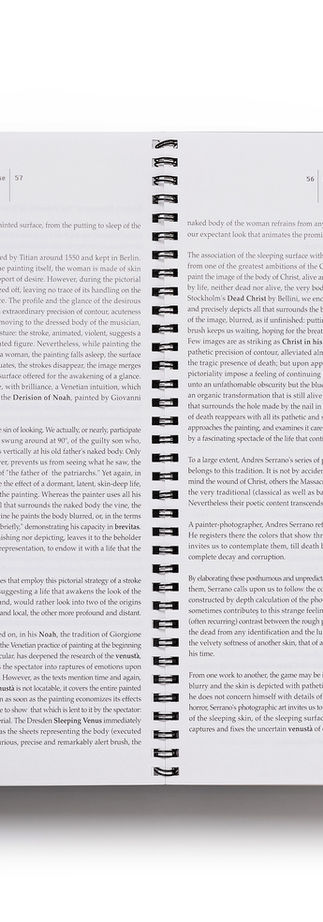
For Andres-Serrano's exhibition, The Morgue at the Tel Aviv Museum of Art, I was invited by the museum's photography curator Dr. Rona Sela to design a visual language and implementations for this project. These included typographic design, logotype and catalogue.
The conceptual basis for the design arose from the content of the curator's interview with the artist, the photographs of his life environment and the body of works in which religiosity and the aura projected from them are evident.
By deconstructing and simplifying the cross shape, I realized the catalogue format, designed a grid, a logotype which was also used to promote the exhibition, and up to the method of binding by a coil that seems to 'sew' the book as a thread along its entire length.
The design brought balance to the presentation of this series of photographs, and moreover, supported and created an adequate platform for making the project accessible to the viewer.
DIVINE IN.TENT, VENICE BIENNALE
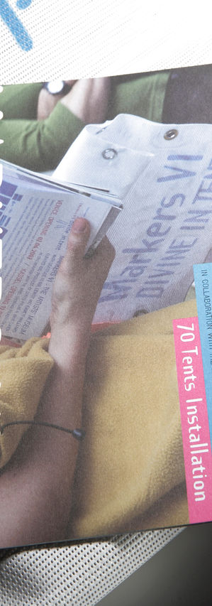
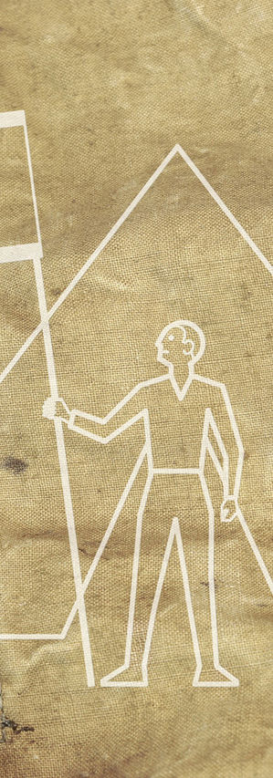
The art installation Devine In.Tent is the sixth project of the Markers series in which I am co-curator and art director. A series of contemporary art projects launched as part of the Venice Art Biennale.
The installation includes 70 tents that I designed, curated by the Artists Museums’ Doron Polak. On each of the tents are printed the works of artists from around the world.
The concept for branding this project is based on the essence of faith and human connection.
The photographs of the installation and the project events in Venice and Kassel, Germany in real time - serve as part of the visual language that expresses the spirit of the project and is adjusted to the production budget.
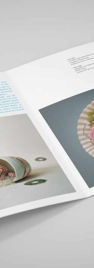
The catalog and the case are designed from the materials of the tents; Industrial mesh, metal rings and thick uncoated paper - as a minimalist kit in blue and white. The kit included a poster, flyers, art works and curator text, as well as additional contributors essays booklets.
FORBIDDEN LIBRARY
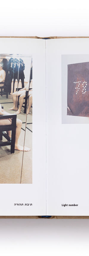
Haim Maor, artist and curator. Second generation of Holocaust survivors. In his personal journey as an artist, Maor examines in his works the components of his memory and identity against the background of his family's traumatic memories of the Holocaust and Israel. His main body of art works explores the elements of his identity in different ways and contexts, in multi-media installations, in dialogue with ’others'. Thus, among the supporters of publishing this book are The Um El-Fahem art gallery, and Massuah.
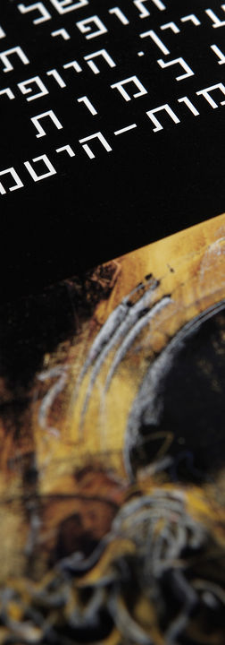
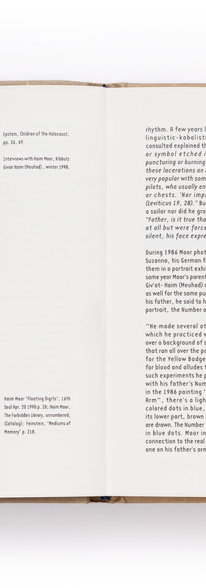
The meeting with Maor was a process of discovering a language and a personal codex, from it and through the dialogue, I recognized and determined the right way to arrange the contents in the visual editing of the book; Making the artistic process and its products accessible alongside texts in two languages.
Intimate A5 format, held in brown wrapping paper bearing a stamp created by the artist as part of his ongoing dialogue with 'the other'.
I chose to separate the texts from the images which were printed on different papers that distinguish between the artistic work and the 'document', the accompanying articles and the references.
In the typographic design of the book, I correspond with the typographic elements that Maor creates in his works and respond to them in a way that mediates the artist's work to the reader.
'MAABARA', HERITAGE MUSEUM
The MAABARA project brings a collection of first-hand testimonials. This is the story of immigration to Israel in its early years - the struggle of many to integrate into the creation of an Israeli identity, while trying to preserve the rich cultural heritage they brought from various countries in the East and West.
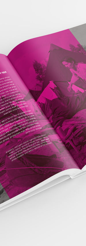
The great challenge in visual editing, semiotics and design of this 300 pages book, which also serves as a conceptual infrastructure for the establishment of a heritage museum, is in combining contents, each of which requires a unique visual identity; The book includes poetry, testimonies, dialogues, archival photographs and historical documents, and a heritage museum program.
The book was produced for the National Heritage Council. The target audiences for the book are diverse, from a wide audience that includes the historical witnesses and their families to students in the education system.
The one who for many years researches, collects and tells the great story of the immigrant communities to Israel is Yossi Alfi, a theater director as well as a unique storyteller - this wide-ranging museum project is his vision realized.
In order to mediate the complex content, the design solution (which brought with it a distinctive identity to the entire project) included the use of bright-transparent color surfaces on top of archival black and white photographs. These were incorporated in a tribute to the typographic design of fonts from the 1950s.
The design process was preceded by my research work in various archives, to collect photographs and documents, which later, after sorting and combining testimonials and images, I was able to characterize the concept and design the book.
*MAABARA: Temporary residential complex for immigrants in the first years of the State of Israel.
MARKERS, VENICE BIENNALE
The International Artists' Museum is no walled-in museum, a worldwide channel of communication linking artists and intellectuals from a variety of domains through a growing global network of autonomous, locally-run art centers, interactive but independently funded.
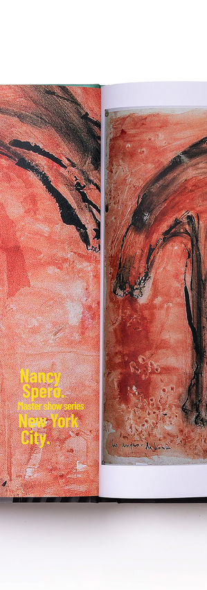
Among the founders of this group are Fluxus artists, such as Emmett Williams, legendary artists Leon Golub, and Nancy Spero.
Since 2001 the ongoing project 'Markers' by the Artists' Museum, which was launched at the Venice Art Biennale and since then 13 large-scale projects have been presented with the participation of more than 700 artists from around the globe.
From the first day of the Markers series, I have been its co-curator and art director. I am responsible for the strategic-visual language of the projects and applied design adapted to different target audiences; Including formulating and designing a call for entries, preparing dedicated content for sponsors, and of course comprehensive design of the exhibitions, performances and their documentation for digital platforms (social and websites; markersart.net) as well as various printed materials such as posters, brochures, unique cases and art books.
This book contains documentation, articles and images from the first decade of the project. The design language is clean and minimalistic. A design choice that enables a proper and coherent reading experience of a large variety of subjects and art expressions.
EXPO, ART AND SCIENCE
An initiative for mediation and dialogue between art and science. Proposal for the Expo and exhibition on various innovation topics; showcasing cutting-edge technologies and advancements in various industries.
The design of this catalog is based on basic industrial materials, such as cardboard for packing paper packages - which is used here for the catalog pages. Corrugated cardboard, a coarse insulation and packaging material, is attached to the catalog cover, which includes an embossed logo in my design, which is anchored together with the cardboard pages by thick screws.
The typographic design is based on a unique diagonal grid and a contemporary San Serif font.
The distinctive design concept is based on the contrast between advanced content packaged by tactile, primary materials to create dissonance and user experience.
WANDERING LIBRARY,
THE JEWISH MUSEUN VENICE
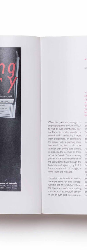
The 'Wandering library’ art project, a part of the Markers series, shows artist books by members of the 'Artists Museum' from around the globe. The exhibition was held at the Jewish Museum in Venice, in honor of the Art Biennale.
The concept for this project and its various implementations, as well as the design of the book, is based on the meanings of the book as an art object, on the concept of the library and its historical role up to the present day, as well as on the location of the event in Venice and from that on the beginning of printing, and more so on the meaning of printing in human culture.
The introductory pages of the book include a typographic design in Gothic (serif) typeface of a historical quote dealing with Gutenberg Print, preceding a spread in a minimalist design in Helvetica typeface of the sentence; This is not a book. In the continuation of the first part of the book, next to the articles, a series of photographs of private libraries - which I took for this project.
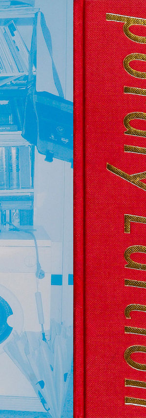
The books’ hard cover in red cloth and a vertical typographic design in a serif typeface - this design action establishes a connection between the historical and the contemporary.
ACUM, ORIGINAL/FAKE
The art exhibition 'It turns', for ACUM - Association of Composers, Authors and Music Publishers, led a campaign for public support in original music creation.
The visual language design (collateral design implementations) for this exhibition began with a study of this industry and the mediums used in it, and with a conceptual process that seeks to make the energy of creators accessible to the target audience.
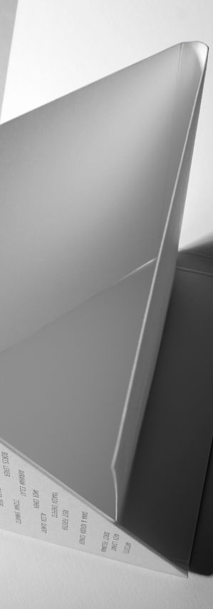
The visual solution I came up with included the attempt to sum the various data collected into a clear value. A simple yet smart case that holds a series of photographs and a curator essay, was based on the concept of origami. One strip of paper which, by folding it, created layers of paper that cover each other in a minimalist structure - which gives expression to the struggle between original and fake.
VIOLENCE & COMPASSION,
CUTLOG/ARTE ART FAIR
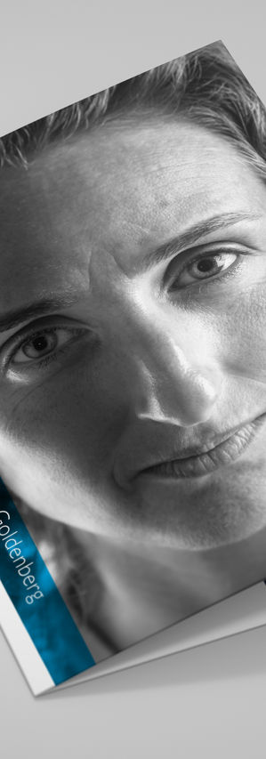
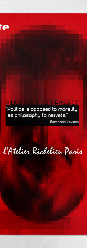
Emmanuel Lévinas' phenomenological account of the "face-to-face" encounter serves as the basis for his ethics, driving the conceptual and visual development. I conceptual-visual translated the 'appearance of the face and its meaning' and the dilemmas explored by the philosopher Lévinas into a series of original black and white portraits of this project artists, which I directed and photographed wonderfully by Yoram Rashef.
The campaign design was preceded by a branding process that differentiated the 'Violence and Compassion' art collection. This branding included typographic elements that connected the works of artists in different styles.
This series of portraits formed the basis of a contemporary art promotion campaign which was presented in New York and Paris in various publications and formats before the Cutlog art fair, sponsored by Arte.
MH CITY GALLERY
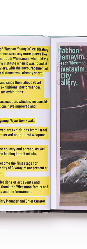
'Machon Hamayim' - the Givatayim city gallery is a unique initiative in the Israeli art arena. In a historic building that was established more than a century ago, in its new use, it presents art from Israel, as well as international exhibitions.
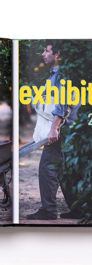
Performance artist and Curator Doron Polak and myself collaborating for over two decades on the ‘Bodies’ art-lab project, as an outcome I was the one to working in an orderly manner on photographing and artistically documenting the stages of the renovation works on the gallery building and at the same time, our 'Bodies' research developed at this site, right from the start of the gallery planning stage.
My artwork, still photographs and video art done on the premises of MH ('Machon Hamayim') gallery, have already been exhibited in galleries and museums both in Israel and abroad.
This book explores the activity of the gallery, which largely stems from the spirit of the international organization - The ‘Artists' Museum'. An activity that includes an immediate intellectual and physical response to various topics.
It is an ongoing artistic operation that combines improvisations in the gallery space and in the public space.
From this I designed the multi-layered typographic concept for the book and the layout of the photographs in a dynamic grid where the internal logic is a platform for changes, all this in order to support the artworks presented and in balance with the spirit of this gallery site.
